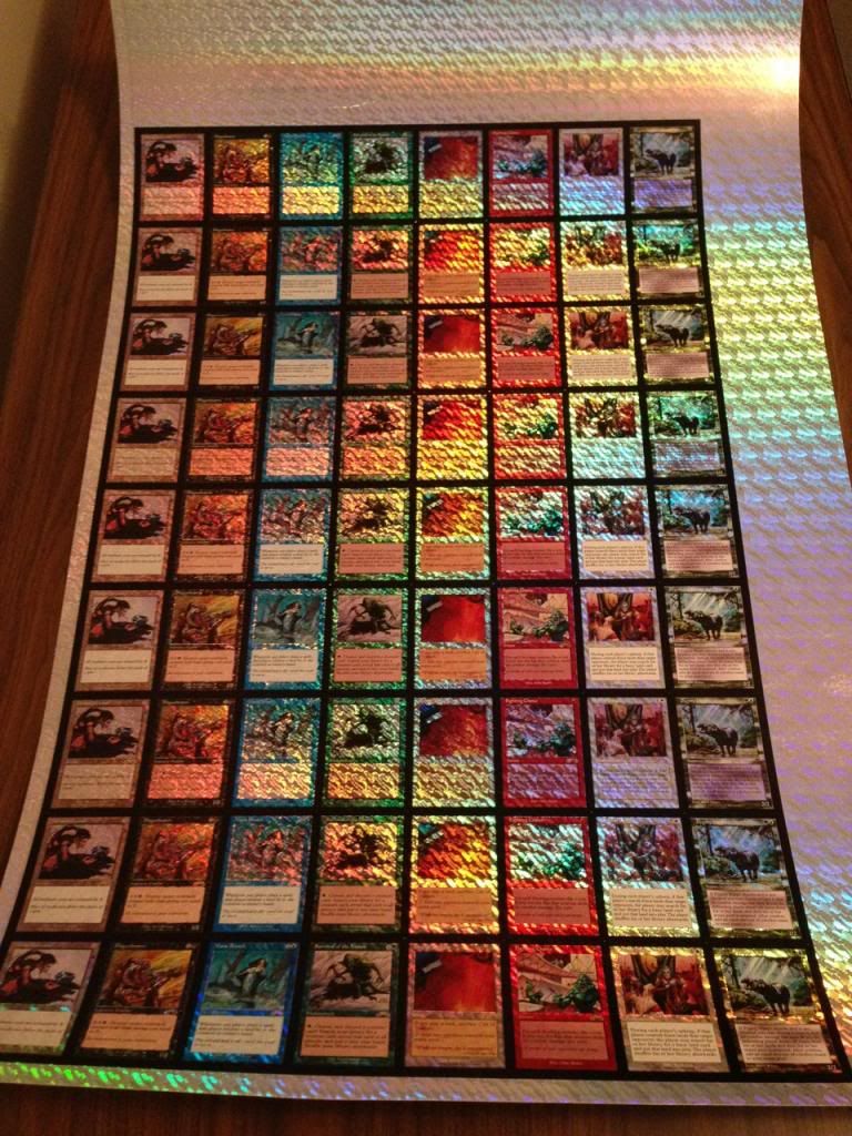
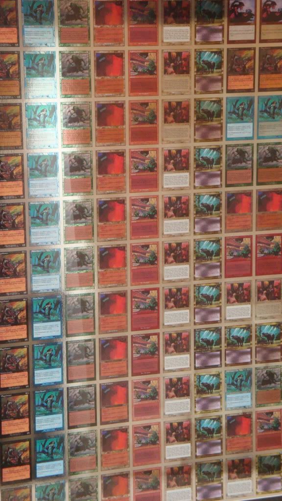
Hey guys! I ended up buying the other sheet that's not pictured in berkumps' post. The foiling process on the one I have is quite a bit different from the other sheet, though I believe everything else is the same. The foiling on my sheet looks more like a "camouflage" foil as opposed to the other one. There's a phone picture below, but I'll take some good pictures with a nice camera in the next week or so.
I wanted to add some details about the foil sheet for the index, since it's much cooler than what I had originally thought. I can't verify if the other sheet is exactly like this or not, but I know who bought it and will contact him to ask.
When I originally started looking to buy the sheet, I thought each card on the sheet was the exact same (so 9 of the same City, 9 of the same Survival, etc.). To my surprise, they are all unique and no two are the same! I've never seen an uncut test print sheet, so I didn't know that's how they printed them.
There are 9 rows on the sheet and I'm going to describe the details row by row (starting from the top). The first descriptor is the number in the right margin. Hopefully someone can help me, as I'm not 100% sure what that means. Is it just the saturation of the ink, or does it describe certain colors being more prevalent? The +1 appears to be darker than the -1, but I couldn't tell any differences in colors being missing, etc.
The second descriptor is about how much foil is on the card. The sheet is broken down into 3x rows of "+1" darkness, 3x rows of "-1" darkness, and 3x rows of "1" darkness. Each of those 3 rows have a different foiling process on them. They either have foil everywhere, foil everywhere except the text box, or foil everywhere except the text box and picture box.
The third descriptor is whether or not the cards have a set symbol. The first 4 rows on the sheet do not have symbols, while the bottom 5 do. I found it very odd that they didn't do either 3 or 6 with the symbol and instead only did 5.
Those are the main differences in each row. However, there is one extra different that makes on the rows unique from the other eight. All the rows have white ink for all the text not in the text box (name, card type, power/toughness, artist name and copyright), except row 3. Row 3 has no white ink in those places, so all that text is foil instead. It looks extremely awesome and I'm not sure why they only tested one row this way.
Row 1: +1 , full foiling on card, no set symbol
Row 2: +1 , no foil in text box, no set symbol
Row 3: +1 , no foil in text box or picture, no set symbol, foil title etc.
Row 4: -1, full foiling on card, no set symbol
Row 5: -1 , no foil in text box, has set symbol
Row 6: -1 , no foil in text box or picture, has set symbol
Row 7: 1, full foiling on card, has set symbol
Row 8: 1 , no foil in text box, has set symbol
Row 9: 1 , no foil in text box or picture, has set symbol
If anyone has any questions, please let me know. I tried to describe all the details fully, but it's possible I forgot something. This is the coolest thing I've ever picked up and I imagine I will have a hard time beating this at any point in the future. The picture doesn't really do the sheet justice. The foiling process looks awesome. It's made in small 1 inch x 1 inch squares, so you can still see the lines that divide each square. It's something I don't think they've ever used on anything else.